Fighting popular misconceptions is often unrewarding for those doing the work.
In my weekly series, WTWA, I often provide special recognition with the Silver Bullet Award.
The advice from the excellent articles cited makes a great review of the year.
In 2015, we gave out the Silver Bullet Award 21 times - the most ever in a single year. Despite the constant fearmongering from some bloggers and media personalities, more and more people are providing individual investors with the tools they need to make informed decisions. Our winners are summarized below. Readers may also want to check into our 2013 and 2014compilations, as many of the same issues persist to this day.
Have any thoughts or predictions on what will dominate news cycles in 2016? Know of a great analyst flying below our radar? Feel free to post in the comments with any suggestions or nominations.
January 4, 2015
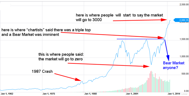
Our first Silver Bullet of the year went to RL at Slope of Hope for his examination of charting "techniques" in the post-2008 recovery.
RL notes:
What can we conclude from all the above? Well, first of all that making long-term trend predictions is not recommended, no-one knows what is awaiting for us in the future. Bull or Bear Market, inflation or deflation, you name it. What we can do, is to predict market trend extensionswith statistical analysis, comparing past trends and current trends and that is in fact what we do with our RL models. We do not know if the market can go to 3000 in the next few years, it's possible if all of a sudden a lot of investors, after staying on the sidelines since 2009, decide to join this 5 years long rally (how about that for a "confirmation signal"?). What we do know (based on our statistical models) is that the market is overbought right now, and it has been rising ~500 points in the last 2 years, although the strongest rise was in 2013, and in 2014 the speed of advance was a little bit slower (maybe a sign that the rally is faltering?).In our view, this strong pace is not sustainable in the long term and some correction inevitably will come, although it does not have necessarily to be a 3-years Bear Market, it may be a 3 months correction, or a quick crash followed by a recovery, etc. What we can do is to gauge the market trend extension from a TIME and PRICE point of view with our model and this is an honest method to gauge the short and medium-term market direction
March 1, 2015
Nicholas Colas and Jessica Rabe of Convergex took on Jeff Gundlach's assertion that equities have never risen for seven years in a row since 1871. With due respect to Mr. Gundlach, the authors primarily took issue with the dataset (courtesy of Robert Shiller) he had used to draw his conclusion.Colas and Rabe write:
"Gundlach used a well-known dataset from Robert Shiller for his findings, but it is not suitable for calculating calendar-year returns since it does not capture exact month-end levels. The S&P 500 actually rallied for eight consecutive years from 1982 to 1989 based on price returns and total returns. The index was also up for nine straight years from 1991 to 1999 using total returns. Therefore, the S&P 500 may have a few more years to run before breaking any records, but volatility will likely rise as well…Whether the stock market finishes the year in positive territory is anyone's guess, but it wouldn't be unprecedented."
April 5, 2015
Barry Ritholtz dug up an old Onion article, as an analogue for what passes as analysis in the financial blogosphere. Readers may be reminded of Sidd Finch.
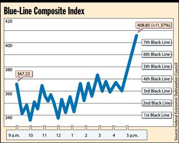
"Given this line's long history of jaggedness, we really should take a wait-and-see approach," Fortune magazine associate editor Charles Reames said. "And even if this important line continues its upward pointiness, we must remember that there are other shapes, colors, numbers, and lines to consider when judging the health of the economy."Reames also warned that the upward angle of the line, which most analysts agreed was approximately 80 degrees, may have been exaggerated by the way the graph was drawn."The stuff that's written along the bottom of the graph is all squished together, making the line look a lot more impressive than it is," Reames said. "Had that same stuff been spread out more, the line would have looked a lot less steep."
April 11, 2015
Bill McBride (AKA Calculated Risk) ended 2014 by asking himself ten questions about the state of the economy. His quarterly reviews helped to measure economic progress over time, in line with his expectations. This innovative approach to interpreting data earned Bill our Silver Bullet Award.
"At the end of last year Bill made a series of ten forecasts about the economy with a full post on each. He provided a three-month update this week. While early in the year, I found it quite impressive. It is more measured than the optimistic economic predictions and much better than those always seeing the worst from any report. See for yourself, and you will understand why I emphasize this source each week. If you are interested in economic growth, housing, employment, the Fed, or oil prices there is something for you."
April 19, 2015
Ed Dolan's thorough deconstruction of ShadowStats is one of our favorite blog posts from 2015. From the way he picks his target, to his measurement of the data - his post reads like a step-by-step guide to winning a Silver Bullet. We found this excerpt particularly interesting:
"As mentioned above, Williams' ShadowStats inflation series incorporates an additional 2.0 percentage point correction to reflect methodological changes that are not captured in the CPI-U-RS series. I would like to examine that number more carefully in a future post, but for the sake of discussion, we can let it stand. If so, it appears to me that, based entirely on Williams' own data, methods, and assumptions, the adjustment for the ShadowStats inflation series should be about 2.45 percentage points below CPI-U, rather than the 7 percentage points he uses.In my view, Williams alternative measure of inflation would be more convincing if he were to make this correction. It would also be less likely to feed the anti-government paranoia of some of his followers, who allege that the BLS is falsifies source data and manipulates reported indicators in the way that Argentina and some other countries appear to do.It is worth noting that Williams himself makes no such claim. He is a fierce critic of BLS methodology, but he acknowledges that the agency follows its own published methods. He argues that the BLS has adopted methods that produce low inflation indicators, but not for motives of short-term partisan politics. Rather, he sees the choice of methodology as driven by a longstanding, bipartisan desire to reduce the cost of Social Security and other inflation-indexed transfer payments. It would be hard to deny that he is at least partly right about that motivation."
April 26, 2015
The "what if?" question plagues individual investors and fantasy football fans alike. While the sports fans can afford to indulge in flights of fancy, investors probably shouldn't. David Fabian won the Silver Bullet for writing to this effect very effectively:
Lastly, I think it's important for investors to forget the "if/then" narrative that seems to be a psychological barrier to living in the present and investing for the future.If the Fed had never….If big banks had never….If stock buybacks had never….Stop worrying about what the world might look like if those things had never happened, because they did and we are where we are. Focus on the present and the things that you can control in order to get the most out of your investment portfolio.
June 08, 2015
We frequently warn individual investors to keep their politics and their investments separate. Morgan Housel earned himself a Silver Bullet by illustrating this with a clear, relatable example. The market has seen significant gains since 2008. If you've been sitting on the sidelines, you've missed some big opportunities.
Take these two statements:"11 million jobs have been created since 2009. The stock market has tripled. The unemployment rate nearly cut in half. The U.S. economy has enjoyed a strong recovery under President Obama.""The recovery since 2009 has been one of the weakest on record. The national debt has ballooned. Wages are stagnant. Millions of Americans have given up looking for work. The economy has been a disappointment under President Obama.Both of these statements are true. They are both history. Which one is right?It's a weird question, because history is supposed to be objective. There's only supposed to be one "right."But that's almost never the case, especially when an emotional topic like your opinion of the president is included. Everyone chooses the version of history that fits what they want to believe, which tends to be a reflection of how they were raised, which is different for everybody. We do this with the economy, the stock market, politics - everything.It can make history dangerous. What starts as an honest attempt to objectively study the past quickly becomes a field day of confirming your existing beliefs.
June 13, 2015
Regular readers know that we like to carefully scrutinize mainstream financial media. Needless to say, we got a kick out of Cullen Roche's colorful guidelines for financial journalists. They're all well worth reading, but our favorites are quoted below.
I. The Stop Scaring People Rule. Scaremongering is not to be tolerated except during the middle of a financial crisis or nuclear war. Writing scary articles for the sake of conjuring emotionally driven page views is not a legitimate business model and is generally counterproductive.III. The Crash Call Rule. That pundit who comes on TV predicting financial Armageddon every week is not a "guru" and is directly contributing to poor financial decisions. Please refrain from interviewing him regularly. Also, see Rule I.IX. The Bubble in Bubbles Rule. If you feel the need to use the word "bubble" please reconsider. This word is only allowed to be used by a select few financial experts (Robert Shiller, Robert Shiller & Robert Shiller). If you are not one of the names listed in the previous sentence please do not use this terminology.
June 20, 2015
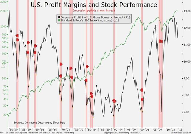
Declining profit margins are a prime target for perma bears in the blogosphere. You'd think after an "expert" calls nine of the last three recessions, this one would go away - but we've been fighting it for years.Pierre Lapointe received the Silver Bullet for taking on the crowd.
"It can take a long time before contracting margins begin to hurt stock prices," Lapointe and colleagues Alex Bellefleur and Francois Boutin-Dufresne wrote in a report yesterday. They cited the 1982-1987 bull market, which took place even though earnings as a percentage of GDP were among the lowest since World War II."It isn't at all clear that margins will contract further from here," they wrote. "They could stabilize and remain near current levels for some time. This wouldn't be a disastrous scenario for equities."
July 04, 2015
Beyond errors in the investment world, we like to caution our readers to think carefully about all kinds of data. Math Professor Jordan Ellenberg, of the University of Wisconsin-Madison, provided a fascinating article about the misuses of numbers. We gave him the Silver Bullet based on his conclusion:
All these mistakes have one thing in common: They don't involve any actual falsehoods. Still, despite their literal truth, they manage to mislead. It is as if you said, "Geraldo Rivera has been married twice." Yes-but this statistic leaves out 60% of his wives.In the era of data journalism, truth is not enough. We need people in the newsroom who can check not only a number's value but also its meaning. Unless we can ensure that, we're going to be reading a lot of data-driven stories that are true in every particular-but still wrong.
July 18, 2015
Zero Hedge is one of the least credible yet oft-cited websites sucking up oxygen in the financial blogosphere. Their supporters are apparently pervasive, which is why we had to give Fabius Maximus a Silver Bullet for his thorough deconstruction. The full article is of course excellent: his commentary ranges from exposing half-truths, conspiracy-mongering, selective use of data, and outright deception.
ZH is an ugly version of Wal-Mart or Amazon. It would be sad but insignificant if ZH was exceptional. But ZH is a model of successful web publishing, probably taking mindshare from mainstream providers of economic and market insights. I see websites using its methods proliferating in other fields. For example, geopolitics has become dominated by sites that provide a continuous stream of threat inflation as ludicrous as the worst of ZH.
July 26, 2015
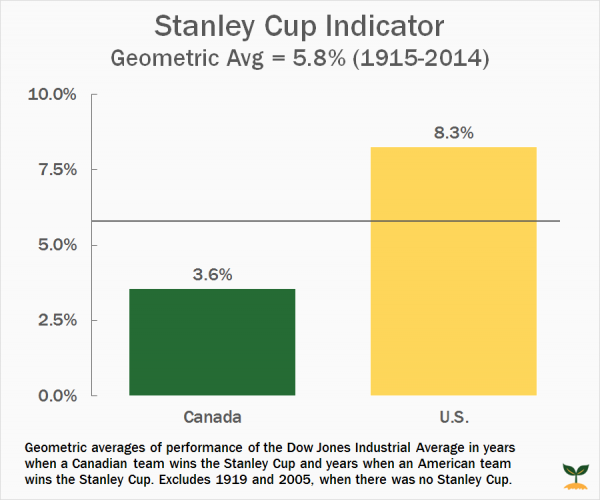
On a lighter note, we greatly appreciated a video done by Jimmy Atkinson at Dividend Reference. His guide to useless (but entertaining) stock market indicators comes with an important lesson attached. Below is one example particularly relevant to hockey fans in the Chicago area.
August 02, 2015
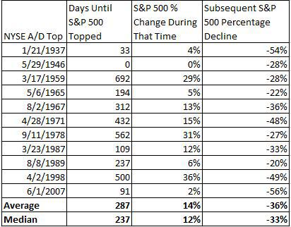
Michael Batnick won a Silver Bullet this year when he abated growing fears about market tops. His careful analysis (backed up by solid data) is a huge asset for individual investors looking for an edge.
Conventional wisdom goes that prior to market tops, the major averages become more reliant on just a handful of stocks to lead the rally. When stocks are making new highs, it's important to look at breadth indicators because indices can pull a nasty trick of masking what is actually happening to the majority of stocks. For instance, the S&P 500 is up 2.3% YTD, however, the average S&P 500 stock is down 0.7%.Observers with a mission fail to note that divergences often resolve to the upside. Here is an interesting table, showing both frequency and the range of gains.
August 22, 2015
We at "A Dash" applaud anyone willing to challenge the so-called conventional wisdom. We gave Barry Ritholtz a Silver Bullet this year for taking on the Death Cross.
…yesterday's decline triggered the dreaded Death Cross, as the index's 50-day moving average crossed below the 200-day moving average. The other major indexes haven't yet succumbed to the Death Cross horror, though the S&P 500 is heading in that direction.In a research note late yesterday, Bespoke Investment Group observed that this was the first time this has happened since Dec. 30th, 2011, or in 903 trading days. They also note the modest statistical significance of the Death Cross. Looking at the past 100 years, they wrote that "the index has tended to bounce back more often than not." Shorter term (one to three months), however, these crosses have been followed by modest declines in the index.How modest? The average decline is 0.17 percent during the next month and 1.52 percent the next three months. By comparison, Bespoke notes, during the past 100 years the Dow averages a 0.62 percent gain during all one-month periods and a 1.82 percent rise during all three-month periods.In an e-mail I asked Justin Walters of Bespoke to expand on the details. He wrote: "Most of the time these crosses don't mean much of anything. This one the forward performance numbers are a little more negative than we would expect to see over the next one and three months, but it's basically 50/50 whether we go higher or lower."
August 30, 2015
Our final award of the year went to Michael Batnick and Todd Sullivan (citing "Davidson) for two separate articles on the same theme. Both illustrate the danger in the way the Shiller CAPE ratio is presented to investors. Batnick notes:
When Shiller says 15-16 is where CAPE has typically been, what he really means is this is what the average has been. However, what he fails to mention is that over the past 25 years, the CAPE ratio has been above its historical average 95% of the time. Stocks have been below their historical average just 16 out of the last 309 months. Since that time, the total return on the S&P 500 is over 925%.
Sullivan shows that the profit estimates in the data are flawed because of accounting changes. He shows that large and completely implausible changes in "earnings" were actually the result of the FAS 157 rules.
Conclusion
As always, you can feel free to contact us with recommendations for future Silver Bullet prize winners at any time. Whenever someone takes interest in defending a thankless but essential cause, we hope you'll find them here. Have a Happy New Year and a profitable 2016.
No comments:
Post a Comment