We learned during the Global Credit Crisis that agency ratings were imperfect for a variety of reasons. Shortcomings of both mathematics and character led to grossly incorrect ratings in too many cases.
But historically, short of such crisis conditions, agency ratings of securities have served millions of investors all over the globe very well for many decades. And as imperfect as these ratings are, the fact is that most investors have little choice but to use such ratings as a proxy for investment risk-- even though what the investor wants to know and what the rating is measuring are, at least to a certain extent, two different things.
Investors are usually trying to determine the likelihood of a bankruptcy of the company they are considering investing in while rating agencies are trying to quantify creditworthiness. To most investors, these are two views of the same scenery. Where agency ratings come in the form of a quantitative rating on a scale, investor conclusions about risk are reflected in today's market price (and hence yield).
By conducting a simple two-step analysis, preferred stock investors can identify preferred stocks that the market may have underpriced, given the risk.
Step 1: Moody's Versus The Market
When rating agencies and investors see risk the same way, a group of preferred stocks with the same rating would be priced by the market such that they offer the same yield. Same risk, same return.
This theory is easily demonstrated by comparing the current yield of two similar preferred stocks issued by the same company. For example, in April 2010 Public Storage (PSA) introduced PSA.PO with a 6.875% dividend. Six months later, the company introduced PSA.PP at 6.500%[1]. With the exception of their dividend rates, these two preferred stocks are essentially identical and both have the same Baa1 investment grade rating from Moody's Investors Service[2].
Since both of these preferred stocks carry the same investment risk (as rated by Moody's), we would expect investors to price them such that they have a similar return (as measured by dividend yield)-- and they do. PSA.PO closed Friday, May 4, 2012 at $27.99 per share, giving it a yield of 6.1%, while PSA.PP commanded a share price of $27.27 putting its yield at 6.0%.
By identifying preferred stocks where this is not the case (same rating but substantially different yield), we should be able to find specific issues where either the rating agency or the market (or both) has blown the call.
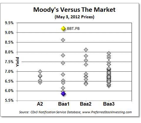
In today's market for high quality[3] preferred stocks we see investment grade Moody's ratings ranging from A2 (at the high end) down to Baa3. Here is how the market's assessment of risk (as measured by yield) compares to Moody's assessment (as measured by their investment grade ratings, highest to lowest).

Each diamond represents a specific high quality preferred stock[4]. If the market and Moody's were in agreement (which they usually are), we would see the diamonds above any given Moody's rating (risk level) stack up very close to each other (they would have similar yield).
But that is not the case in today's high quality preferred stock marketplace. In fact, after repeatedly performing this analysis for several years, there have been very few times where the market and Moody's were so out of step with each other (late-2007 was one such case when both the market and Moody's were guessing at risk resulting in the diamonds appearing randomly all over this chart).
Looking at the Baa1 level, you can see that there is no agreement whatsoever between the market and Moody's. The ten high quality preferred stocks that Moody's is saying are exposed to the same level of creditworthiness are providing yields from 5.9% all the way up to 9.2%. That's an enormous disparity.
Has the market blown the call here or has Moody's misjudged the risk. If the risk level is the same (Baa1), is the preferred stock with the 5.9% yield overpriced (pushing its yield down) or is the one with a 9.2% yield underpriced (pushing its yield up)? Which is it?
Step 2: Overpriced Or Underpriced
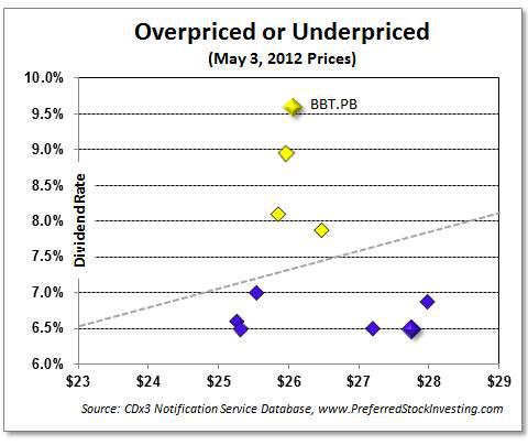
Dividend yield is based on the current market price that a specific dividend rate commands. By decomposing the yield of these ten Baa1-rated high quality preferred stocks, a clearer picture starts to emerge.

The dotted line on this chart shows the market price and dividend rate combinations that produce today's average yield for Baa1-rated high quality preferred stocks - 7.1%. That is, every point along the dotted line provides a 7.1% yield to the investor.
The four preferred stocks (diamonds) that appear above the line are priced so low that their yield is well above today's market average. To provide today's average yield of 7.1% (the dotted line), these four preferred stocks would have to be priced much higher. BBT.PB, for example, is from BB&T Corporation (BBT) and offers a 9.6% dividend rate. To provide a 7.1% yield, this preferred stock would have to be priced at $33.86 per share. But BBT.PB closed on Thursday, May 3 at $26.05, well below what the market for a Baa1-rated high quality preferred stock is currently commanding.
Using this two-step analysis, preferred stock investors can identify high quality preferred stocks that the market has priced below where the market average says they should be, given the level of risk (as quantified by Moody's).
Why The Low Price?
But before rushing out to buy shares of the underpriced preferred stocks that this two-step technique unveils (which are all trading above par at the moment), we should try to understand what is causing the market to price these four issues so low. Is the market seeing something that Moody's is not, or is the market looking at a different type of risk altogether?
The answer to that question becomes obvious when the diamonds are colored by industry, yellow for preferred stocks that are Big Bank trust preferred stocks (TRUPS) and purple for everything else. Coloring the preferred stocks by industry allows us to learn even more about today's preferred stock marketplace.
Notice how the four underpriced preferred stocks (yellow) are all from the same industry - Big Banks (while not included here, the same pattern that you see on the above Baa1 chart, where the Big Bank TRUPS appear to be the ones that are underpriced, occurs at all other Moody's investment grade levels as well).
In today's market, Moody's and preferred stock investors are judging two different things. The Wall Street Reform Act, signed into law in July 2010, made all Big Bank TRUPS callable for the first 90 days of 2013, regardless of their published call dates[5]. While Moody's, as always, is attempting to quantify the risk associated with creditworthiness (or lack thereof), those investing in Big Bank TRUPS are, for the next several months, more worried about the negative effects of an unexpected call.
It is redemption risk that is currently causing preferred stock buyers to avoid Big Bank TRUPS in favor of non-bank issued preferred stocks. Consequently, Big Bank TRUPS prices are falling (raising yields) while the market prices of high quality preferred stocks issued by non-banks are rising (lowering yields).
While this two-step analysis allows us to identify underpriced preferred stocks, adding an industry color code also allows us to see an additional pattern that, in this case, explains the disconnect between the market and Moody's.
Once the effects of the Act pass us by, the diamonds above any specific rating in the first chart should return to reflecting a similar return as measured by yield. To the extent that they do not, either the market or Moody's has blown the call as identified in the second chart.
As with any quantitative analysis, there are a variety of exceptions and caveats that come along with this two-step analysis. But the results can be very informative about how the market and the rating agencies are viewing the risk of a preferred stock investment.
Footnotes:
[1] Source for all preferred stock data in this article: CDx3 Notification Service database, Preferred Stock Investing, Fourth Edition, see PreferredStockInvesting.com. Disclaimer: The CDx3 Notification Service is my preferred stock email alert and research newsletter service including data for all preferred stocks and Exchange Traded Debt Securities traded on U.S. stock exchanges.
[2] Preferred stock ratings issued by the various rating agencies are very similar. Ratings issued by Moody's Investors Service are used for this analysis; substituting those from another agency would produce a very similar result.
[3] "High quality" preferred stocks are those that meet the ten risk-lowering selection criteria from chapter 7 of my book, Preferred Stock Investing. For example, high quality preferred stocks have investment grade ratings and the cumulative dividend requirement.
[4] This analysis excludes high quality preferred stocks that have exceeded their call dates and issues that have a pending redemption that has already been announced: NCC.PB from PNC Financial (PNC), USB.PJ from US Bancorp (USB) and UDR.PG from UDR, Inc. (UDR). Also excluded are preferred stocks issued by Citigroup (C) since Citi's too big to fail treatment in the marketplace has rendered the market prices of its preferred stocks non-comparable in the context of this analysis.
[5] While the Act does not require that these securities be called, it removes them from the bank's Tier 1 reserve calculation beginning January 1, 2013. Since inclusion in Tier 1 was the primary reason that Big Banks issued these TRUPS to begin with, many of these securities are at an increased risk of being called as January 1, 2013 approaches (see the Seeking Alpha article titled "The Hidden Risk Of Buying Today's Trust Preferred Stocks" for more details).
By Doug K. LeDou
Disclosure: I have no positions in any stocks mentioned, and no plans to initiate any positions within the next 72 hours.
Good blog. I would like to know about strategy behind the preferred stocks to maintain shareholders.
ReplyDeletepreferred dividends